Case study 06 · Editorial design
Timothy Goodman Profile
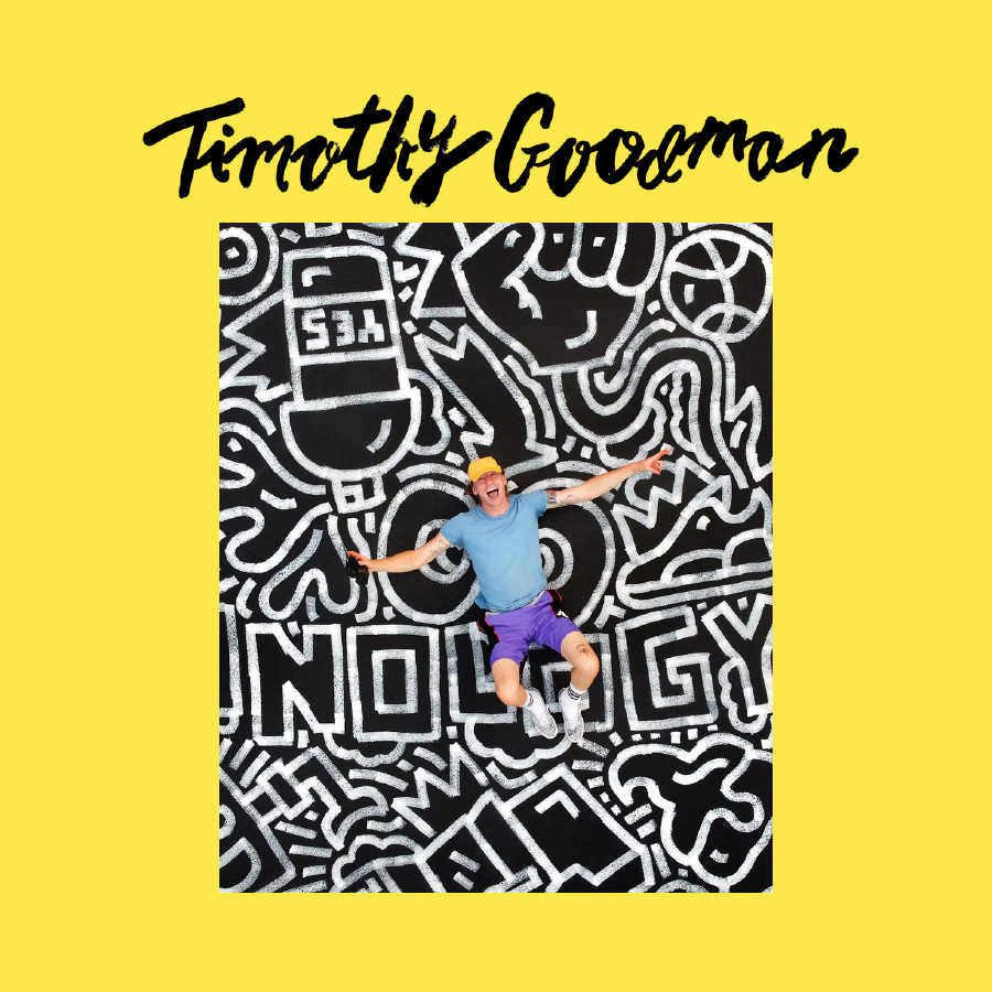
A nine-page artist profile that turns research into a compact editorial system inspired by Goodman's energetic lettering and image-led practice.
Goal
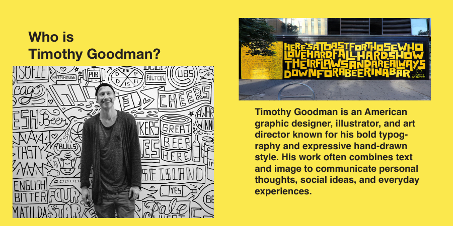
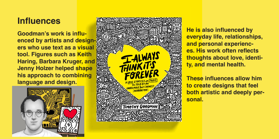
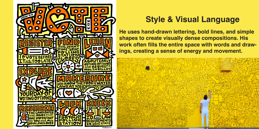
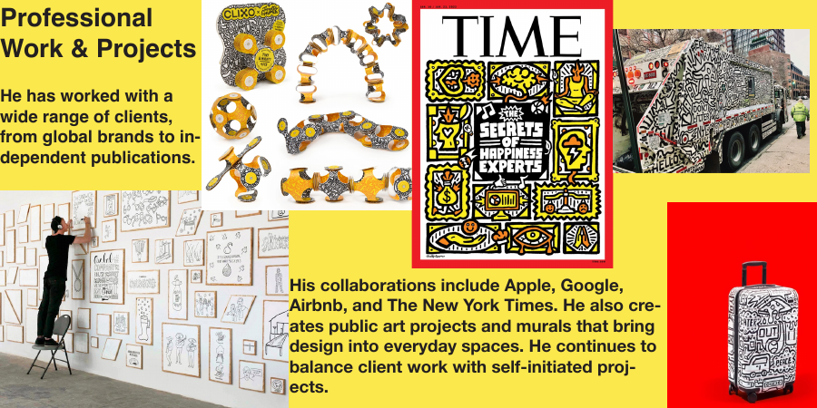
I researched Timothy Goodman's background, influences, visual language, professional work, and impact, then organized that material into a short profile. The challenge was to reference his expressive style without allowing the pages to become difficult to read.
System
A high-contrast yellow and black palette connects the booklet to Goodman's bold public work. Repeated margins, modular image blocks, compact paragraphs, and strong sans-serif headings keep the information structured, while selected lettering and artwork carry the visual energy.
Reflection
The most successful aspect is the consistent visual language across the booklet. Balancing text and imagery required the most iteration: expressive references can quickly overwhelm a page, so the layout works best when the typography, images, and open space each have a clear role.